Mobile UX Projects

Hi,

I worked on several Mobile Application User Experience projects (personal / companies I worked with) some in team and some as an individual designer. Usually clients approach either with an idea that needs to be explored or with a defined feature list .

In the earlier case, I have spent time in studying the domain, conducting user research (in few cases) , checking the technical feasibility , considering the budget constraints present them a discovery document / sales pitch document .

It contains the App feature list , description and mockup designs of the future application.

When I have a defined feature list and I worked on the User Scenarios, Interaction models and wireframes, I did the site maps, and sketched wireframes based on the mobile platform ( iPhone /ipad / android ).

Below are the roles I played across the projects. (Please excuse me for the loading time of some files)

Some of the responsibilities I shared are

1. Doing User Research ( Online survey , personal interviews )

Projects: Talent App / Medical App

Talent App : A mobile application which acts as one stop solution to explore various talent apps and manage career profile.

Medical App: A mobile application that enables doctors to read through common symptoms of patients and prescribe drugs.

2. Understanding various domains or verticals ( which I enjoy , as we get to gather more knowledge )

Projects : Social AR  / StockXchange

Social AR : A mobile application that leverages Social Media and Augmented Reality

Stock Xchange : A mobile based game that enables users to trade online.

3. Doing Market Research and making Report( knowing the placement of a particular product or service )

Projects : Blackberry Research1 and part 2

4. Making Info graphics

Projects : Nike (ver 1 ) (ver2) / Thunderbolt – Infoviz project (personal)

Nike info graphic shows the various mobile apps released by Nike and different versions released at later point of time.

Thunderbolt : Visualization of Ar Rahman’s discography which is further extended to be a mobile application  that familiarizes unheard artists. (read full paper)

5. Participating in brain storming sessions ( to get ideas about app feature list )

Projects: DealNotifier / BarScene / Social AR .. etc

6. Discussion with developers to know the feasibility aspect of mobile application ( Thanks to Shirish / Raafey for explaining me, patiently)

Projects : Social AR / Bar Scene / Deal Notifier / SeeMyRadiology

7. Preparing Discovery document ( which involves responses from various API s)

Projects : Bar Scene

8. Exploration of Interaction Models and making custom UI components

Projects : Barscene UI / UPS UI / Custom UI

9. Presenting Mock Up designs

Projects: StockXchange and others

10. Presenting Sales Pitch documents to sales managers / clients

Projects : CatchUp and others

11. As a UX designer I created Workflows, Site maps.

Projects :  UPS and others

12. Sketching Wireframes.

Projects: SeeMyRadiology /TrackGuide / Ultimate PowerSpeak

SeeMyRadiology: A mobile application that allows doctors to share X-Ray reports and study case by case.

TrackGuide: A directory of race tracks in USA

Ultimate PowerSpeak : An iPad application for sales persons to record and prepare before going for a presentation.

13. User Interface Design ( thanks to Joby my team mate, who mentors me on Pixel Perfect design )

Projects: SeeMyRadiology / DealNotifier and Others

I have taken interest to explore, Industrial design and practice conceptual sketching in free time.
Real Time Information Project

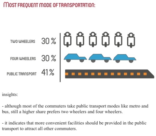
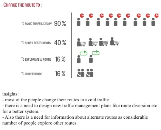
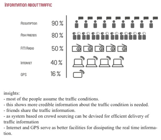
Design Brief : To perform an ethnographic design research to do a comparative study and analysis of traffic , transport and infrastructure while studying people perceptions, behaviors towards traffic rules, signals and  information.

Problem : How do people perceive the traffic signals? Do they understand them effectively? How do they behave under different circumstances? How the intervention of design in presenting information, building infrastructure will make the traffic system efficient?

The project is aimed to present the opportunity areas in the field of Real Time Traffic Information and propose new concepts.

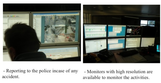
Summary : During this project I along with two other team members had an opportunity to conduct the ethnographic research in Vienna ( which is considered to have one of the best transport model). We did our field observations, user research , interviews with SMEs and visit to Transport Control centers and carried similar research in Bangalore, to compare and draw parallels to find out the differences, problems and opportunities in the domain of traffic and information. The final outcome is a mobile application which delivers real time information and service design.

Team : Divya, Vinay and myself

Guide : Dr.Bibhudutta Baral (NID faculty ), Dr.Peter Simlinger ( IIID)

Design Process :  The major activities we did during this project are Domain Study , Brainstorming ,Evolving  Relationship Models  , conducting Design Research , doing Comparative Analysis, Creating User Persona , sketching User Scenarios , exploring various Concepts , sketching Wireframes for mobile application, User journey for Service design, User reviews.

Stage#1 : Domain Study and Relationship Models.

I helped my team in thorough domain study involving Traffic and Transport in Indian scenario which covers the infrastructure , safety , speed of operation , hierarchical road system etc.  Also we studied the various facts about Metro Rail systems in different cities, Bus transport system and how these systems rely on Real time information. The different modes the real time information is disbursed to users, the technologies available are also studied.

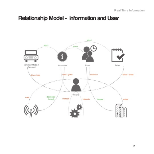
I participated in brain storming sessions, to pool up all the key words and categorize them under key categories. We then formed a relation ship model  showing various interactions in the transport and traffic domain.

Stage#2 : Design Research and analysis in Vienna.

I helped my team perform photo ethnography, in recording observations, perform personal interviews , interact with Subject Matter Experts, prepare questionnaires, conduct surveys, and analyze the responses. The above research formed the basis for our comparative study and further to develop our concepts.

We could gather important insights in the areas of :

Bicycle commute

Parking

Signage

Pavements

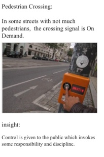
Pedestrian Crossing

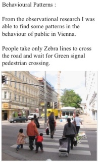
Behavior patterns.

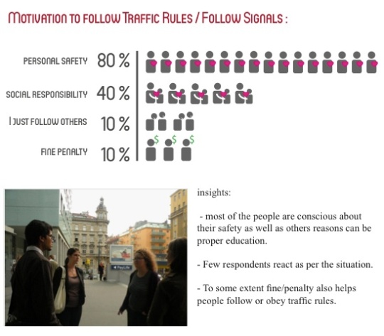
I conducted personal interviews to gain more insights about the perception towards traffic rules / signals and information.

Stage#3 : Design Research and analysis in Vienna.

We performed similar ethnographic research in Bangalore to gain insights into Indian traffic , transport and information system.

Also from the personal interviews and surveys, results are analyzed .

Stage#4 : Comparative Study

I performed a comparative study based on three aspects 1. Infrastructure 2. Information and 3. People Perceptions which is based on the insights gathered from the research conducted in both the cities.

Infrastructure:

1.The infrastructure in Vienna comes most of the times with the advanced technology , auto- mated system for efficient and trouble free service. The design of the infrastructure is user friendly thus enhancing the experience of pedestrians and motorists ensuring their safety.

2.Due to increasing population and thus vehicles, there is a scarcity of land. Infrastructure like : parking system are not so efficient except for specific areas like under- ground spaces in buildings.Measures are taken to provide efficient traffic control system and traffic management system. There is a lot of scope to build good infrastructure by taking measures to lay strong design principles with long term view.

Information :

1.Vienna city has a strong informa- tion design followed in every aspect of public infrastructure, traffic system and transport systems.It is very evident in all the display systems, signal systems , wayfinding modes and maps.

It presents a homogenous and clear picture to the target audience.

The real time information about the different modes of transport helps peo- ple in hassle free journey. The waiting time is effectively reduced with these information systems.

2.Bangalore since is still developing , it is the right time to bring the founda- tion of good information design into every aspect of the infrastructure. Since the city is huge, it is even more important to have effective wayfinding system.Lack of proper information about the traffic conditions and public transport modes makes the travel in Bangalore hectic.

However with the inclusion of dynamic display boards on highways and showing a positive sign towards real time information the Government is looking for a promising future.

There is a need to form an alliance with information design institutes and lay a common ground for strong design principles in various projects.

People Perception and Behavior :

1.Vienna’s public show strong sign of good traffic education and maturity. Good lane discipline, safe pedestrian crossing , very low signal jumping are some of the really strong evidences of responsibility towards the traffic safety .

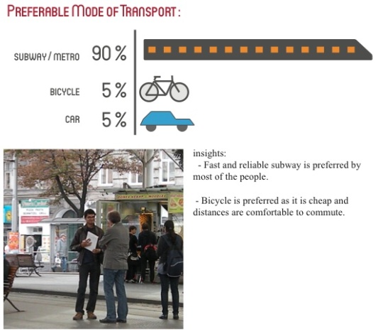
The behavioural patterns show a sense of eco friendly nature. A considerable number of people prefer bicycles as their mode of transport and majority prefer public transport.

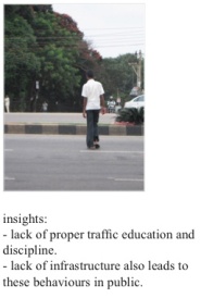
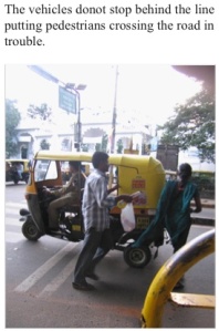
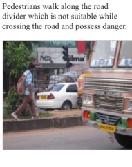
2.One of the major challenges for the traffic system in Bangalore is the traffic education of motorists and pedes- trians.The discipline in the drivers, pedestrians can be considered the root cause of majority of accidents.Lack of lane discipline, jumping sig- nals , triple riding , over speeding are some of the frequent violations.

The above comparisions gave me a scope to build a user persona with clear set objectives.

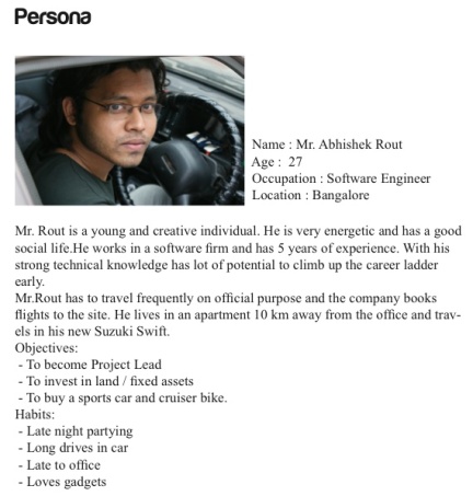
Stage#5 : Creating a User Persona

I created a user persona with certain objectives and habits which helped  me gain clarity to come up with concepts.

Stage#6 : Conceptualization  and User Scenario

Based on the research study some of the key problems and opportunities identified in the domain of traffic systems and real time information are:

– traffic education and discipline in motorists and pedestrians.

– real time information for motorists in more efficient means.

I came up with concepts :

Concept 1:
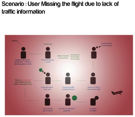
Presenting real time information about traffic in mobile phone, and suggesting alternte routes to the user.

Concept 2:
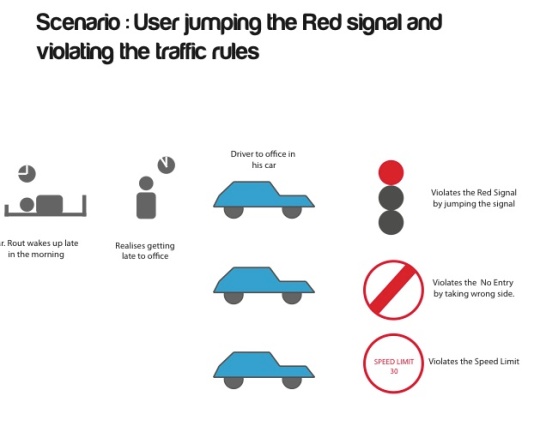
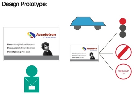
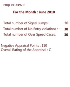
An appraisal system which tracks the traffic discipline of its employees based on signal jumping.

Stage#7 : Wireframes and User Journey

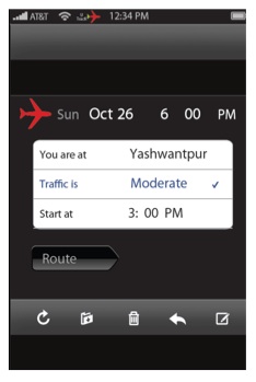
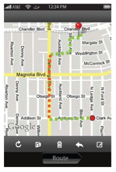
Considering the above scenarios, I could make mobile application wireframes.

Stage#8: User Review 

I have shared the design with a group of users for review and I have got  feedback which I have considered for revision. Excerpts of user review is given below

” the second (the RFID chip that records traffic violations) is a splendid idea but would require to have mandatory traffic signs tagged, otherwise the signs would not be able to leave their mark on the identity cards of car drivers (which leaves the question unanswered what to do with traffic lights).

According to the current state of the art – battery powered tags would be needed (passive tags unfortunately won’t be able to cover distances of more than 0.5 m) and, first of all, a system would be required that records and relates the motion of vehicles to given limits/restrictions. *) ”

Outcome:

Design Document is presented with all the findings and design concepts.

Tools I used: Field Notes, Camera, Adobe Illustrator, Adobe Photoshop, Adobe inDesign .

Where did I fail and What I learned : I feel I couldn’t make effective UX wireframes and the UI design was not impressive. However after practicing and working on various mobile applications project , I could now create amazing UX workflows and awesome wireframes.

The Bosch Project

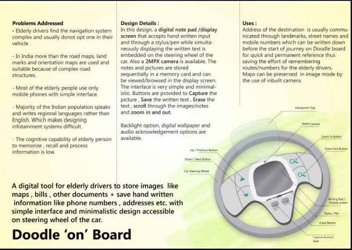
Design Brief :  To design an infotainment system on a low cost automobile for elderly driver , in Indian context.

Summary : Elderly drivers ( age > 65 years ) face many difficulties in driving due to increasing physical , cognitive and psycho motor disabilities. With the increasing travel needs and poor infrastructure, there is a greater need for effective Human Machine Interfaces in personal automobiles.

The project is aimed at following an end to end design process to come up with Infotainment System for these elderly drivers.

Team : Vinay, Divya and myself. Each one of us took a specific problem that emerged out of combined research to develop a solution.

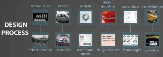
The design Process : We followed a User Centered Design Process and focused on user activities to find the abilities and limitations of the elderly drivers . It gave clear idea of the interactions and how they can be enhanced.

It involved stages like : Domain Study , Information Structuring, Design Research , User Persona / Mental Model , Guidelines , Concepts , Mockups , User Review. I will explain them in detail below.

Stage#1 : Domain Study and Structuring Information

I helped in doing a thorough domain study by referring various resources like books, websites on Automobiles, Infotainment Systems, Human factors of Elderly drivers and current trends in Indian Automobile market. We could get a holistic view of the automobile and elderly driver domain and I helped summarize the information it into three parts : Evolution of Infotainment Systems , Understanding Indian Elders and Understanding Indian Environment.

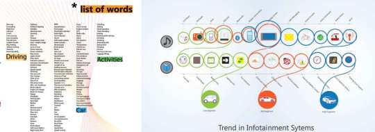
During the next stage our team performed brain storming sessions based on our personal experiences and knowledge gathered from the domain study.
We recorded all the key words and categorized into Key groups. Then I could form relations between them to make an Affinity diagram and HMI relationship model.

Stage#2 : Design Research

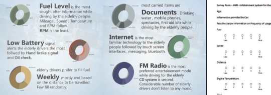
We interviewed potential users using contextual inquiry, in order to understand their behaviors, feelings, complications and experiences. We did ethnographic research by observing users in their natural self while driving, parking and other activities. We also interviewed sales people, to find what the users prefer to have in their vehicles. We found out from the service engineers to find what problems do users bring to them mostly.

I helped in forming a survey questionnaire, recording the observations , taking photographs during field trips.I helped in analyzing the research results.

Stage#3 : Creating User Mental Model and identifying Problem.

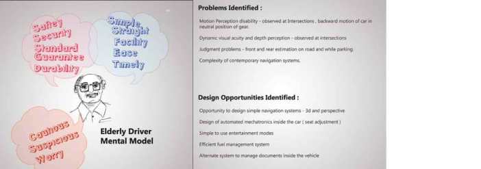
I helped create a mental model of the elderly driver and found possible problems involved and design opportunities available.

The list of problems and opportunities identified are :

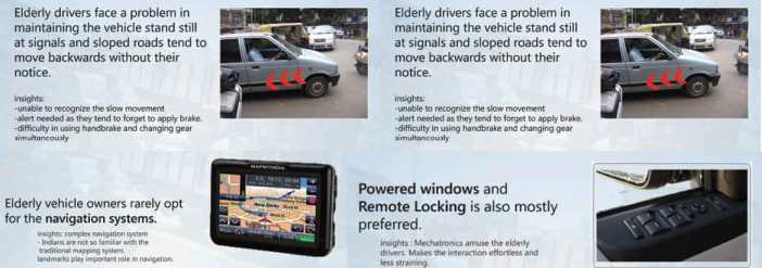
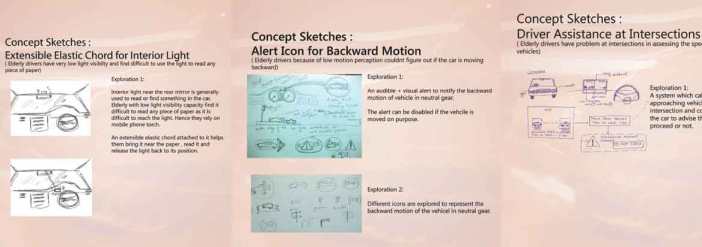
1. Motion perception disability – mainly at road intersections , backward motion of car when it is in neutral gear.

2. Dynamic visual acuity and depth perception at intersections.

3. Judgement problems – front and rear estimations on road and while parking.

4. Complexity of contemporary navigation systems.

5. Opportunity to make navigation system simple.

6. Design of automated adjustments inside car.

7. Simple to use entertainme

Based on these problem and opportunities I proceeded with a select few to find solutions and conceptualize them.

Stage#4 : Conceptualization and Guidelines.

I have learned from my guide that while designing Human machine Interfaces for Elders (in particular) , we need to follow certain guidelines based on the industry practices. These is very important as they form constraints while designing our solutions. The guidelines are categorized into Vision related guidelines ,  Auditory related guidelines , Cognition related guidelines  and Motor capability guidelines .
For example, vision related guidelines deal with certain parameters like depth perception , sensitivity to glare , night time visual activity etc of the elderly drivers. Similarly others.

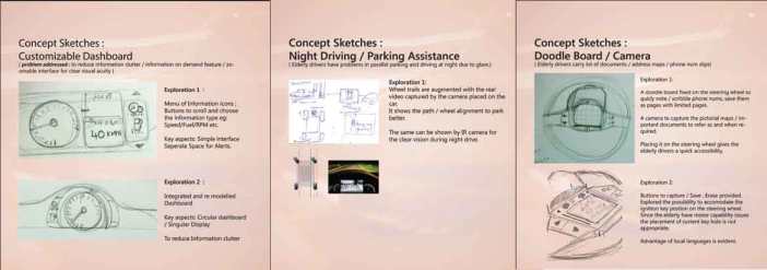
During conceptualization, I took each problem and explored different solutions.

Stage#5 : User Scenarios and Detailed Designs

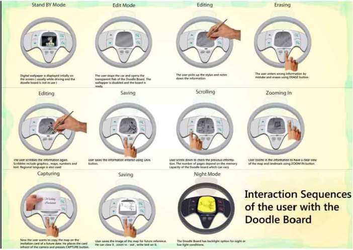
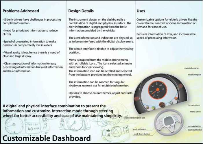
I sketched user scenarios and made detailed design based on the concept explorations. Here I presented the problems I intend to address , the details of the design and the various uses of the proposed design.

I carefully considered certain principles like Poke-Yoke where the user cannot perform certain actions in any other way other than the prescribed (correct) way which enhance the usability and usefulness of the design.

Stage#6 : User Reviews and Outcome

I have shared the detailed design with a select user group, for user review. Most of the feedback was based on the ergonomics and usability. I have recorded the feedback and considered them for revision.

The project was submitted as design document and submitted as a poster for the International Institute of Information Design ( IIID ) 2010 Expert Forum on Traffic and Transport in Vienna. I considered the feedback from experts to incorporate into my design.

Download the poster

Complete project document

Tools I used :  Photographic Cameras – Field Notes – Survey Forms – Sketching – Adobe Photoshop – Illustrator – Indesign

Where did I fail and What I learned : I presented concepts to the Bosch HMI team, which were very much out of the line for implementation And the lack of detail in Design document. So I came up with different explorations that are technically feasible and viable. I also had to re-do the complete document with good detail and showing continuous process.

Human Memory Interface :)

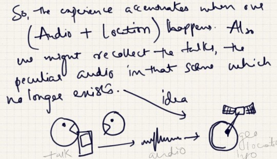
Like most of my thoughts start from the washroom, the thought about human limitations emerged as well . Well, we believe nothing is impossible, rather Impossible is nothing. But there are things we cannot acheive. So, I zoomed out to see, how can I catergorize the things we do currently.They are based on our physical and cognitive abilities.

Like, seeing,hearing,tasting,smelling..etc, and the limitations are ofcourse to an extent where we cannot see beyond a point, cannot hear which are not in frequency range, cannot taste or smell beyond a number so on.But the highly ambitious humans sometimes aped from our fellow beings on the planet  to achieve the unachievable using tools.These tools give us the magical power to see beyond the stars, deep into cells and now we have power to push the limits.

Our senses are extended.

I asked my dear friend eager to know her version. She replied in one word ” memory “.I had to ask her again and again, whether forgetting is our limitation or remembering more is our limitation.Yes, this is a tricky question, especially if you have a girl friend ! But it evolved into a series of thoughts answering the question

” What is the limit of human memory ? ”

Everything resides in our memory calmly as if nothing exits , until we try to recall.Like loads and loads of pages in a book, with each topic tagged.How many pages can our brain hold? What if the index or metadata is lost ?Do we still hold the pages ? If yes, how many pages can we hold ?

For sometime let us compare our human brain with a computer.

If the disks are full, there is load on the performance. If the data is not organized, or we donot know the use of the data available.If the data is not used since ages ?Then, all the information is mere Waste ! Is it the same in case of our brain ?

If we can delete the tags , free the memory ? Would our performance be better?I just read according to the Interference Theory , the new information gets preference over the old ones due to competition.What if we have choice to eliminate the competition ?

Lets bring a HMI – human memory interface to highlight and erase the data, to make more space for the new.Inversely if you want to be connected with the past, and remember a lot. Take a print of tags /meta data to revise and remember the data otherwise you might forget.

A mobile application to do all the above things ! How about it?Imagine the list of things possible.You can scan and tell your girlfriend, the dress she was wearing during your first meeting.All the firsts, All the bests precisely.

You can delete all the information related to the worst movie you ever saw!Well, we can still have a ” CONFIRM DELETE ” no worries 🙂

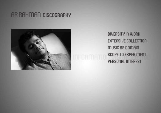
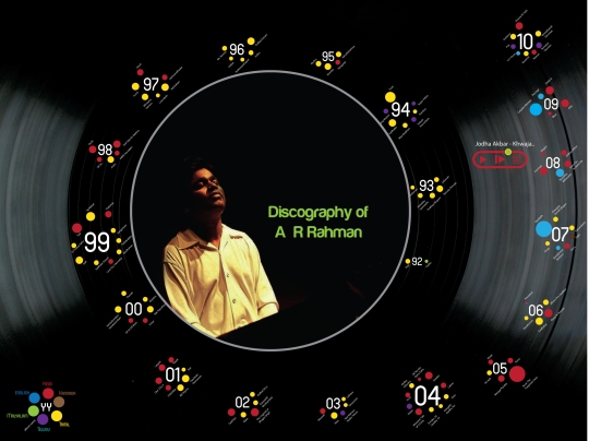
Ar Rahman-Discography

It is an interactive information visualization project as part of my course study at National Institute of Design, India.

AR Rahman is a music composer/singer/musician from south India. His work is mostly film and is a double OSCAR winner. He has a diverse collection of albums spreading over genres. He is one of the few directors who brought technology into music and has done lot of experimentation.


Also music as a subject is very old, unique which allows scope to imagine and visualize very different  interpretations and at the same time there is a lot of scope to experiment.

I’m  personally a very big fan of Ar Rahman and it’s been a very old desire to showcase my view and interpretation of his work.

Process  :


Before attempting at any information visualization It is very important to understand the Context in which the information is used, the target audience and the degree or levels of information we would like to present.

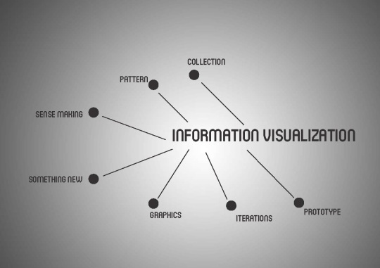
The basic steps involved in information visualization are

–  gathering the data from data sets or collective data over a period of time.
–  observe the pattern from the data.
–  then try to make a sense out of the collected data by considering some parameters (e.g. time, number of items etc)
–  attempt to show something new or a different view of the data which otherwise is not evidently seen.
–  by the use of graphic design and other graphic elements we can add more meaning or simplify the comprehensibility of the information.
–  by iterating on the design and trying out various ways of representation we try to refine the info visualization.
–  we can make an info visualization interactive so that the users can dig through the levels of information.

Context and Target Audience:

The context for which I would like to visualize this information is for a platform where the information about the artist is studied, the work is observed, where the songs can be loaded and listened to interactively.

The target audience would be internet users, who would like to know about the artist ( Ar Rahman ), listen and know more about his work while getting a bigger picture of his discography.

Iteration 1:

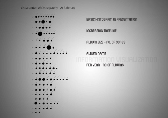
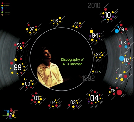
Initially I just collected the data about the albums composed by AR Rahman, from the start of his career to the latest album. I have also considered the number of songs, composed, year of release, album name. I represented the above information as a basic histogram.

It gives the first level of information. The size of each dot varies with the no.of songs in the album.

I have arranged the albums according to the date of release which shows, the no.of albums released per year.

By representing the information as a basic histogram, the first level information becomes very evident and easy to grasp.

Iteration 2:


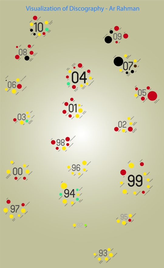
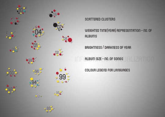
Here I have introduced the color to add a level more to the information. Each colour represents the language in which the album is originally composed. With this we can at a glance grasp the information that the more of number of albums composed are in Tamil etc. Also I have tried breaking away from the linear representation of time line and introduced, weight and size in the year number to visually represent most number of albums produced.

Iteration 3:


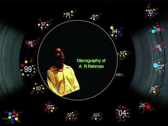
I have considered a Vinyl record as background to show the music aspect of the design and the spiral alignment of the albums to show the evolution of the artist through the time period. Clear representation of the legend helps the user to comprehend.

Interactive Info Visualization :

By making the info visualization interactive, the user can dig in more levels of information or have a big picture view of it. Also, I wanted to include the media player functionality at the same time providing information to the user.

A very minimalistic player interface is provided whenever the user hovers the mouse on any album.

The interface consists of a play / pause button, next track button and play list icon. There is also an elliptical seek bar which also shows the progress of the song played.

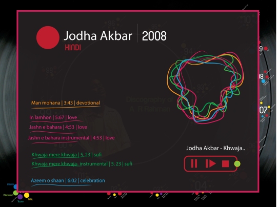
Whenever the play list icon is clicked , a new frame opens to show the list of songs, with the genre specification including with assigned colour, time length of each song, the player interface and a wave type representation of all the songs overlapped.

Explorations:

I have explored various representations of the information in which I wanted to show the albums and songs connected according to their genre or the feel they give to the listener. With this connectivity I can give the user a chance to choose the genre and play the songs connected.

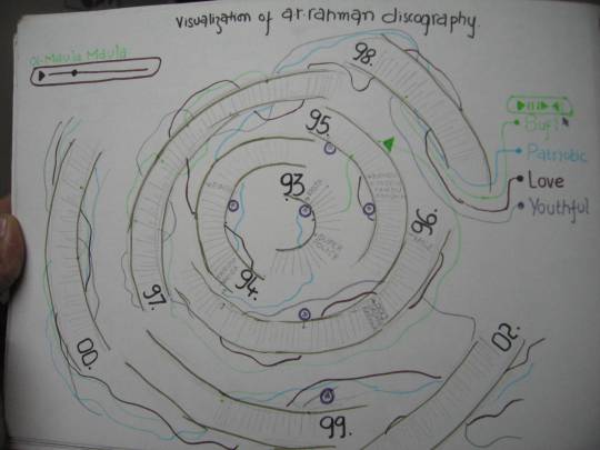
I have tried various other explorations apart from the spiral structure of albums.

Wave type representation:

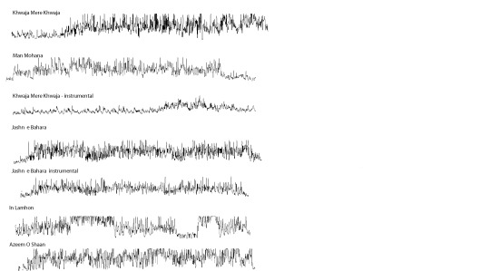
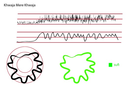
The purpose of representing a song as a wave loop is to show the characteristics of the song, whether it is a soft number, or a heavy musical number. The user can get a feel of song visually. The color of the wave is taken from the genre of the song. So the user can get the information about the song at a glance. When all the waves are overlapped the user can get the feel of album at a glance.

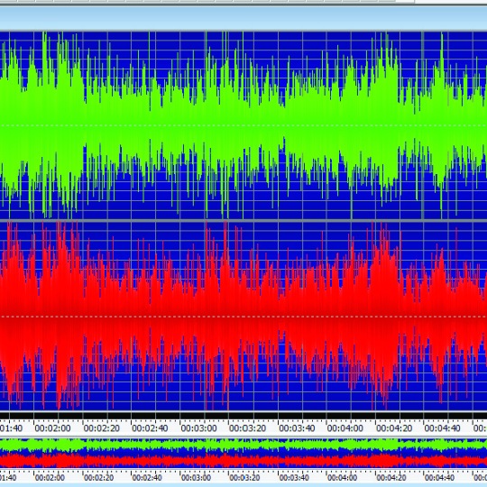
The waves for each songs are obtained by extracting the original composition of the song into a waveform (here, done using a software ) and drawing an outline of the waveform to get a simplified one.

Shuffle:


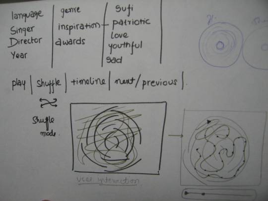
Shuffle can be used in a different way to make the design more interactive. A drawing area can be provided where the user can scribble any curve and the curve sits on the spiral connecting the songs randomly from the albums and plays them.

This is a user generated random shuffle playlist.

Future Work:


In future I would like to reiterate the final design , include more data like the 1. popularity of tracks 2. awards won by Ar Rahman etc. while making the player more interactive.


Dynamic Way Finding

Recently in Bangalore there was a fire accident in Carlton Towers a high rise corporate building on the Old Airport Road. The visuals on TV and News papers were very disturbing as I see innocent victims of the mishap women and men inorder to save their lives started jumping from 8 floors to experience a painful death. Others who were stuck in building were choked and fainted. Few others stuck in fire and dense smoke tried to figure out the way and reached no where. Fire in Carlton tower

The building was having a good architechture and were practicing fire drills regularly to train the residents. Still there is something missing.

Unlike the fire drills ( a mock of escaping activity usually done in corporate building ) this situation had something intense the PANIC. Yes panic in emergency situations leads to wrong decisions like jumping from high floors, getting stuck in smoke etc. Victims of Carlton Fire accident

So in emergency situations and panic struck situations the way finding is very difficult.  The decisions should be taken considering the real environment , eg: avoiding fire , collapsing beams etc, explosive equipment.

Do the designers consider all the above while designing the orientation / way finding boards suitable for the emergency conditions ?

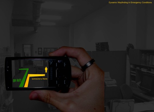
SO there is a possibility of designing a Dynamic Wayfinding Strategy  which allows the users ( victims stuck in emergency conditions) to be able to make decisions more smartly avoiding panic . This dynamic way finding can be possible by summing

Information Design + Intelligent Sensing of the environment+ Medium for Users.

Eg: Proper signs, Warnings , Placement of signs  which adapt to the dynamic information from different sensors , which give the realtime information about the environment and the medium can be the most prevalent like the cellphones/ mobiles usually the users carry.

The picture on the left shows an illustration of how the Dynamic Wayfinder helps the user stuck in smoke filled office space to find his/her wayout . It also shows other people stuck in the space . The way is dynamically generated .

Way finding when combined with other fields like Context Aware systems and Augmented reality as explained in above example as one case can be effectively implemented to save lives of people.

I’m keen to take it forward by studying the existing technologies and prevalent wayfinding tactics.

Please give your valuable comments and suggestions to take it forward.

Interaction Design meets Music

I listen to music a lot. That too I’m a huge fan of Ar Rahman.

I listen to his music appreciating his usage of instruments, the transition he brings from different tunes.

His music makes me feel the emotion, the environment and the time. It makes me travel across time and space.
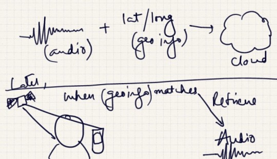
Recently I saw a video of Ar Rahman on NDTV where he introduces his latest instrument he bought for his studio. He played an Indian raga on it.
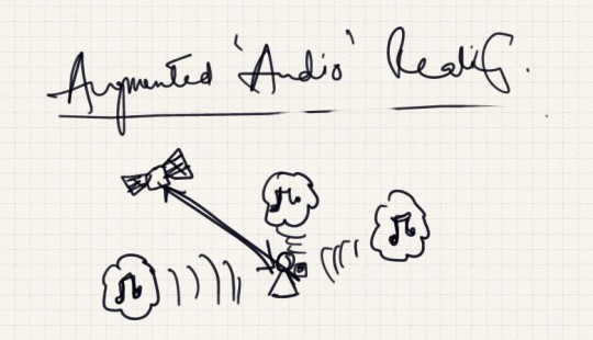
The other day I was listening to Rehna Tu (last 2 min ).. from Delhi 6 composed by Rahman. I suddenly recognized the instrument same as the one he played.

I then searched a bit to know about the instrument . Below is from the website. Haken audio.

Designed by Dr. Lippold Haken and manufactured by Haken Audio, the Continuum Fingerboard is a Midi performance controller that allows unprecedented realtime musical control. With a greater pitch range than a traditional 88 note Midi keyboard, the Continuum offers realtime continuous control in three directions for every finger that is placed on the playing surface.
Included internally is a custom designed synthesizer, specifically programmed to take advantage of the subtle and dramatic expressive musical possibilities of the Continuum.
The Continuum is available in full-size (nearly 8 octaves) and half-size (nearly 4 octaves) versions.

The instrument is played by pressing and moving finger on the board. (Watch Rahman play)

It is a new interactive mode which enjoys the 3 dimensional space and produce more precisely the notes.

New interaction modalities can span across different disciplines like music in this case , medicine, agriculture, etc.  can create great innovations.

Interaction design can cross boundaries. I’m planning to work on this more.

Design for the Next Billion!

Faculty : Anxo Cereijo and Riccardo Sala

Overview : The course was mainly directed to teach us the Design Conceptualization, building Wire frames and Mockups.

How it started : The day one after the introductions and the program agenda , we have been introduced to the Maslows pyramid and the user needs. The user’s are categorized into three types as per our course

1.Bottom of the Pyramid : Earns < $2 per day , basic needs

2.Middle of the Pyramid : Earns an average income of $100 to $ 300 per month and works for basic necessities and few luxuries.

3.Top of the Pyramid : Earns > $ 300 per month

Also the above were again classified into various categories based on their behavior eg: Strugglers, Ignorants , Early Adopters etc.

Design Objective : ” To improve the life of next billion people in the BOP (Bottom of the Pyramid) using mobile internet communication system “

Design Process : We have considered the design process like:

1.Domain Study

2.User analysis

3.Conceptualization

4.Market Research

5.User Research

6.Persona Definition

7.Information Analysis

8.Information structuring

9.Task Flow

10. User Journeys

11.WireFrames

12.Mock ups

Team : Abhay Vyas , Aditya Dipankar , Kumudini , Manoj Manduva and Shilpa Chaudhari

We started knowing the basic characteristics of the BOP people. Their Needs and the issues they face. This user analysis gave us a good starting platform and demanded more stress on the user centric design approach.

We have also considered India as our initial diaspora and studied the prevalent conditions and opportunities.

We had a brainstorming session which resulted in 3 major ideas :

1. Railway ticket booking through mobiles

2. bartering system through mobiles.

3. Saving and making simple transactions through mobiles.

We ruled out the 1 and 2 idea as they do not cater the majority of the user segment and the impact would not be more.

India has 400 million of BOP where as the total railway passengers per day would be only < 3% of BOP population.

Most of the BOP are illiterates and are not familiar with the mobile transactions. This was also a big challenge we had to solve in this process.

After the market research and further improvements in the view of Indian context we have come up with a service

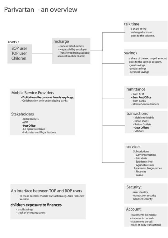
” Parivartan – the change for good ” as our solution which enables the BOP to save money and make simple transactions over the mobile phones. It is a non-bank led mobile banking solution.

So as shown in the above figure, the user can save money in simple terms as recharging his/her mobile phone.

The user can also make Mobile to Mobile cashless transactions.

We have designed this solution to make maximum utilization of the existing infrastructure like retail outlets and Post offices in the villages.

Thus we could reach the entire BOP population to make a significant change in their lives.

For the detailed explanation of the concept please go through the presentation below.